What Your Browse Page Says About Your E-Commerce Brand
Shopping or browse pages tend to be the domain of the usability team, with utility and efficiency being the primary goals for optimization. There’s good reason for this as conveying the important product attributes can help users make purchasing choices, guiding them down the sales funnel. And click through rate to the product’s detail page is a critical performance indicator. But the browse page can also be an opportunity to deliver and reinforce value statements about your brand too. Visual clues on the product listings deliver brand messages with repetition, which aids in comprehension and recall.
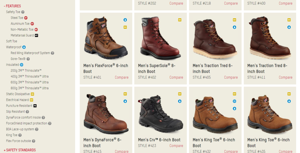
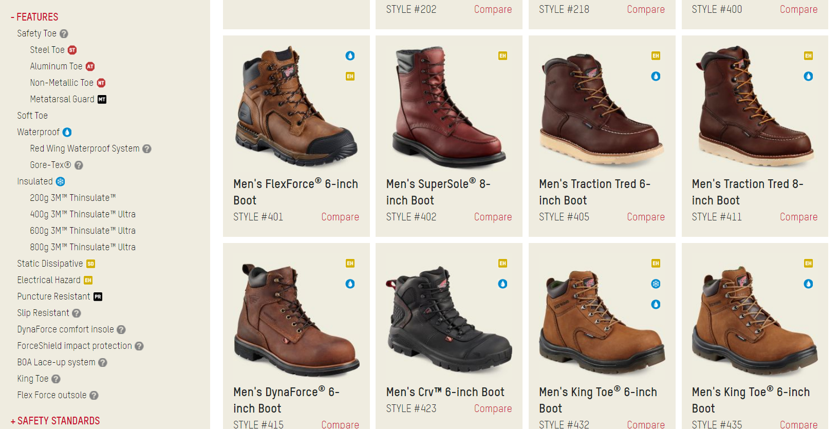
Have a look at this browse page for Red Wing work boots.
They have codes that indicate the features of each pair of boots in relation to workplace needs. Filtering options include insulation against electricity, waterproofing, etc. Besides helping a customer navigate the site, displaying these product attributes sends a message to users that this brand is serious about work and their boots are purpose-built for the task. Visitors get this information at a glance, without having to read.
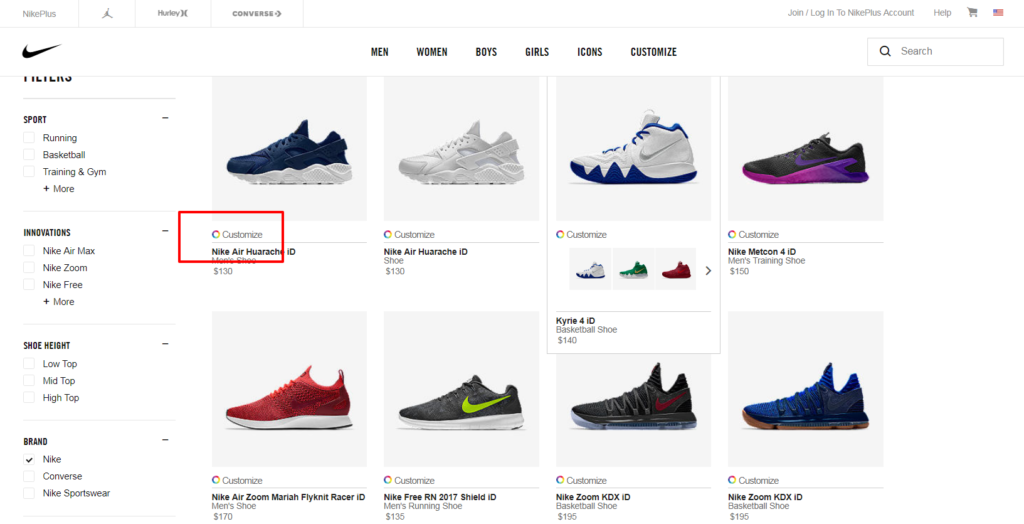
Compare to another shoe site NikeID, that is more geared toward the fashion-conscious and those the like to express a unique personality.
This site allows for color personalization and notes each product that is eligible for the feature. The addition of color wheels to each product image reinforces their brand’s commitment to co-creation and personalization.
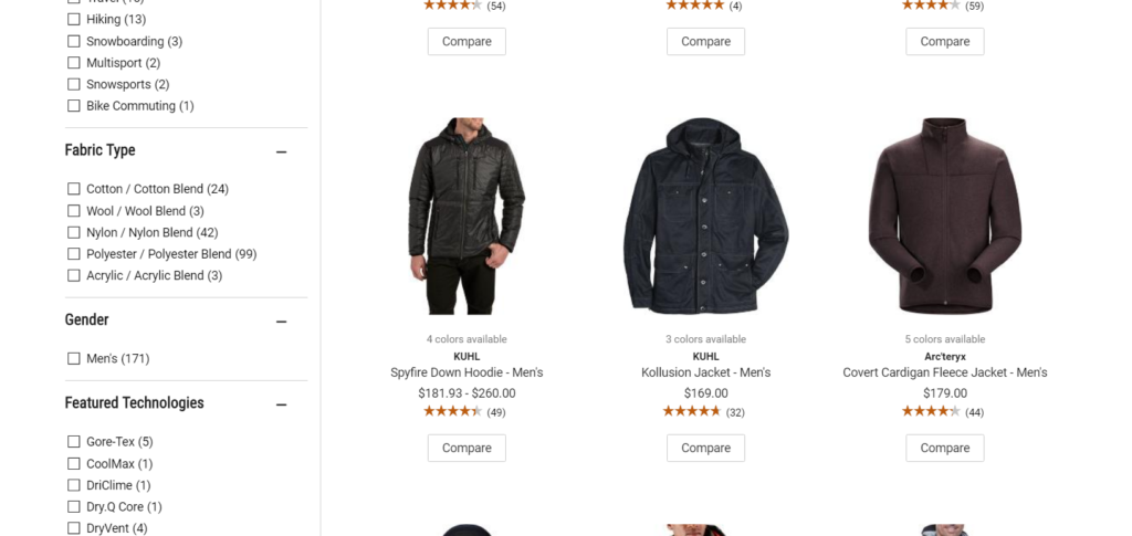
The outdoor retailer REI uses a different browse page template for their outlet versus their main store. Here is their main store’s listing of jackets.
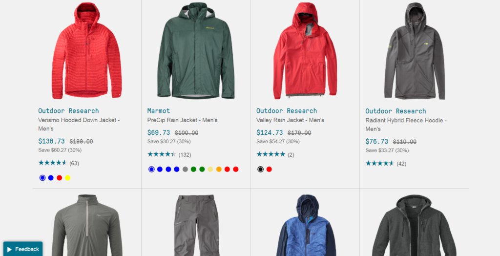
The outlet “REI Garage” displays products in a similar way but emphasizes the bargains by using strike-through pricing and calculating the percentage savings.
Because they’re delivering a different message in their outlet, they use a different template.
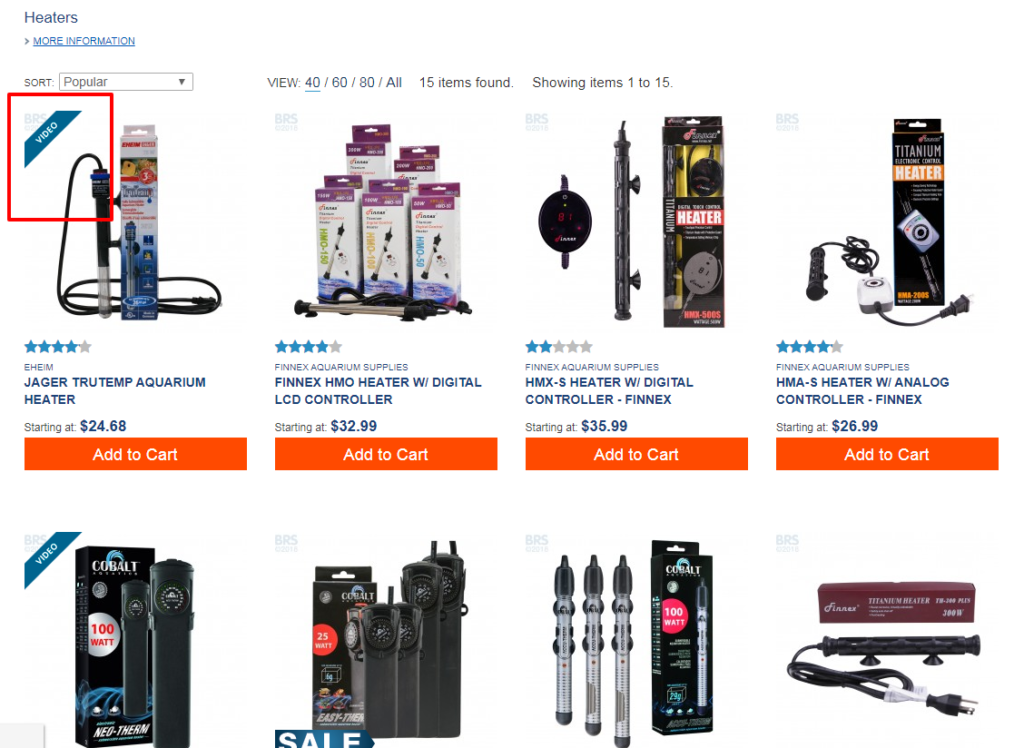
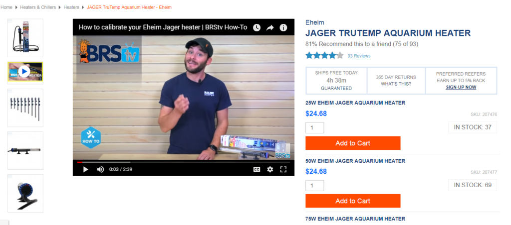
Messages can extend beyond the products to include store policies and content marketing. Bulk Reef Supply serves the DIY reefing community and has invested heavily in tutorial and product review videos. They add value to customers by offering lots of helpful guidance and infuse their product listings with visual cues to remind visitors that help is available.
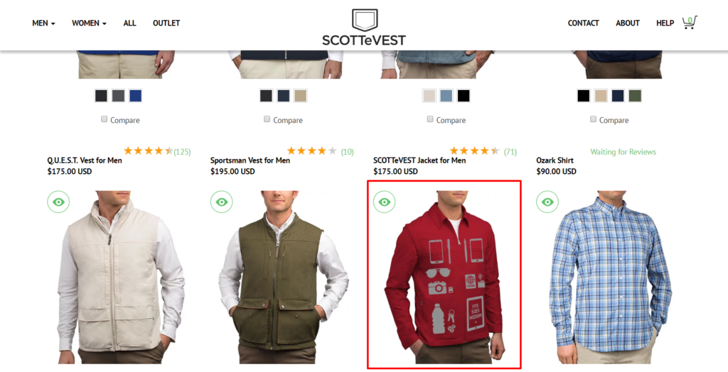
 In addition to badges, product images themselves provide an opportunity to lay out value drivers. In this case SCOTTeVEST offers an ‘x-ray’ of their apparel on mouseover. Besides being somewhat functional for browsing, it delivers the idea that you can carry a lot of stuff in these closes without looking bulky, which is the center of their value proposition.
The fact that these visual brand messages are native and repetitive is the key to this opportunity. Product listing pages with 50 or more products listed at a time offer a chance to drum key attributes into visitors’ heads as they scroll, in a way that feels natural.
Tactics for delivering brand statements are often at odds with usability tools designed with utility in mind. But the browse page for a product catalog offer a rare chance to do both in the same place.

